Contiki Holidays
Improving Contiki’s product page UX/UI to improve mobile CTR to booking engine
Scroll ↓
Headline results
We observed a shift towards mobile conversions, so we recognised the need to have a mobile-optimised product page
From internal and external feedback, we knew that our trip pages weren’t reflecting the magic of the Contiki experience
Product page to booking engine completion rate up 54.8% YoY
Engagement rate up 16.8% YoY
Why?
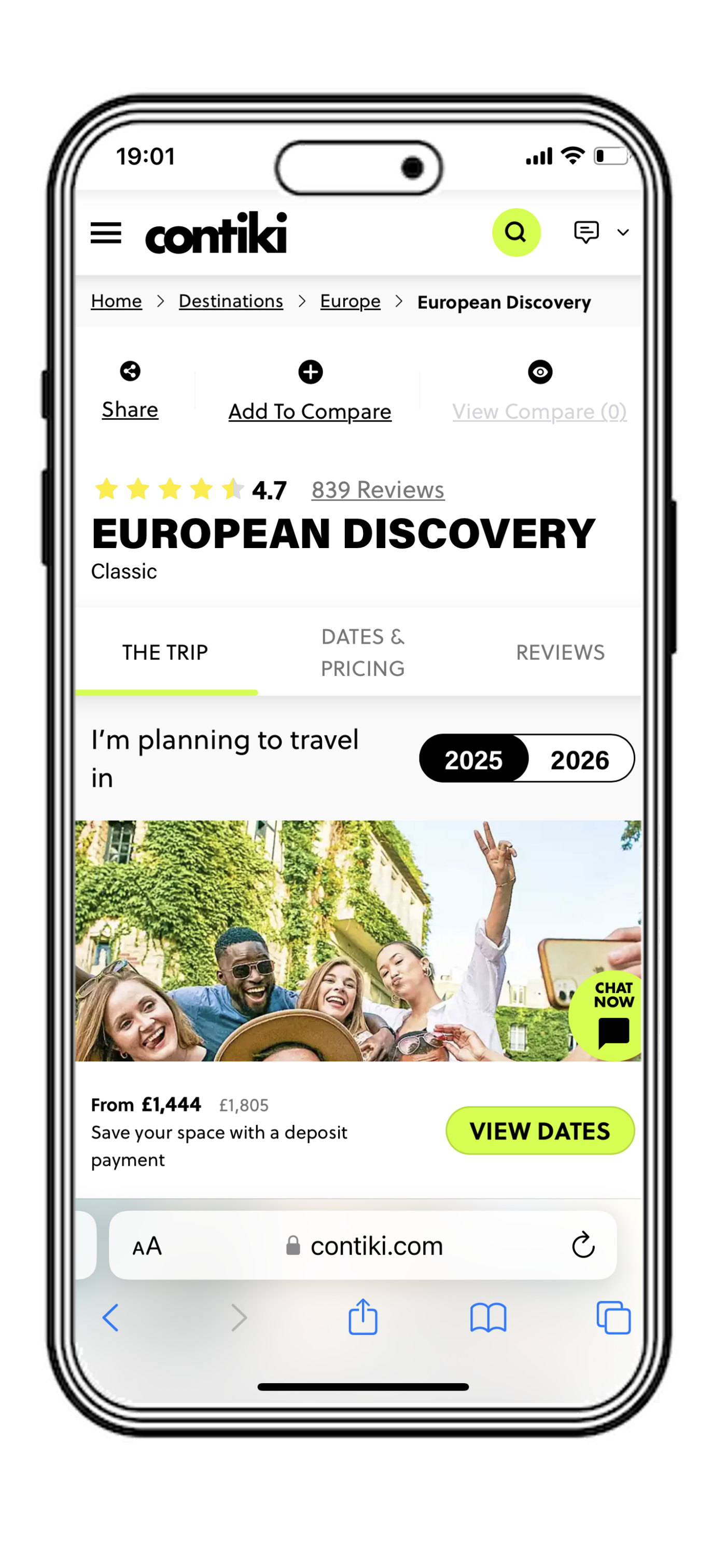
Old vs new style comparison
A few of the key differences between the old and new style. Not an exhaustive list as it would be a very long page!
Old style
Removal of tabs format and cleaner first view of product, with more key info above the fold (guided by split-testing)
New style


Instagram or TikTok style of UGC component, keeping users on the page for longer


More choice for trip itinerary - skim or dive into the detail as you want

Optimizely experimentation - ran two experiments to determine whether the old tab design was outdated, and to move key info up the page. Both variants won, so we combined the two.
GA4 data - researched and benchmarked key product metrics like engagement rate, clicks on key components and completion rate
Qualitative feedback - user research with external participants and internal stakeholders to understand problems and opportunities
Hotjar recordings - checked recordings and heatmaps to get an idea of real usage of the template
How did we do it?
Quantitative & Qualitative Research
〰️
Quantitative & Qualitative Research 〰️
Design
〰️
Design 〰️
Features definition - the Product Manager defined and wrote out each features, ensuring no room for misinterpretation
Epic creation and tickets refinement - working as a cross-functional team with Product Owners, Developers, Designers and Product Manager, the tickets were refined and agreed upon
Agile development - components were released to the CMS as they were ready and accepted by QA and the business, before the entire product layout was rolled out
Development
〰️
Development 〰️
Design Sprint - borrowed from the Google Ventures Design Sprint framework to get a cross-functional team together to produce lo-fi wireframes
Async design - Web and UX Designers took wireframes and produced high fidelity prototypes based on rounds of feedback from me
Business signoff - at each step, wider business stakeholders kept informed and approving of the designs
Release & Reporting
〰️
Release & Reporting 〰️
Split-testing a gradual rollout - initially released to lower sales volume selling regions, with A/B testing in place to ensure scientific reporting and high degree of confidence
Released to ROW during less commercially important period - despite hugely positive initial results, we waited until a gap in commercial events to release to the rest of world
Reporting on success - key metrics consistently tracked and reported to the business